Decorating around Brown Leather Couches, Sofas, Chairs, Seats Really
Hello Love!
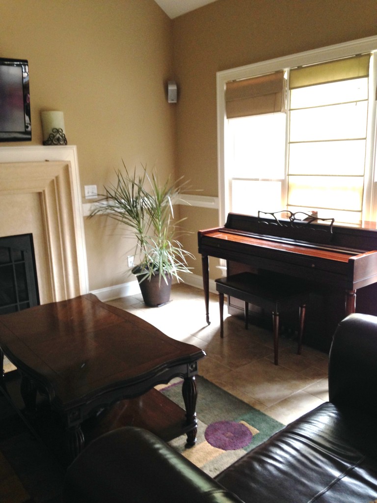
This is the current space and project I’m working on in the Interior Decorating side of things…♥
 The Reveal coming soon! How soon? I don’t know because I just started on it! We’re hitting the flea market in about 2 weeks time, but I do have a few DIYs before then! I’ll try desperately to get them up on this here blog ^_^
Any time that I’m doing a client’s space I LOVE to just grab some inspiration from the interweb.
I’m so honored to be working on such an amazing space for my client who wants me to help her decorate with what she already has. When I walked in I truly felt as though I can do something spectacular!
We are on a budget, therefore we are working with what we have and doing some smart shopping in flea markets, thrift stores, etc. Just follow me on FB, IG or Twitter for Behind the Seams action!
Some people may not know what to do with dark couches and the reality is, it’s just a balancing act. You can see that it’s bottom heavy and dark colors, especially black can cause a “hole” in a space.
Sooooo we are keeping the couches, but I’m totally ok with that! I can’t wait to just make this space sparkle! Transforming it to be picture perfect and living ready for my client. Let’s face it, a drab space is not really live-in material haha, j/ko or not. O_O
Dark couches? CHALLENGE ACCEPTED!
Design is all about moving the eyes. There’s something about “stagnimification” – the being of stagnate state and not free flowing at all. (O.k, so I made this word up, I’ve always wanted to make a word up and I thought this was the perfect moment.) that is just not good for anything, i.e. stagnant water. Moving Forward!
Here are just a few swoon worthy spaces that I’ve gleaned inspiration from!
This couch though. I’m going to be honest here, I’m usually not a fan of brown couches, but Love…OMG this couch is spectacular! (Lately spectacular has been my new word, I swoon words at times. Just FYI)
Great Googly Moogly Oh My! Ok Loves, Check it out. see why this works…Lets dig in shall we? Do you see the pink in the painting above the t.v? Then the pop of pink in the book shelf near the left chair? Theeeeeeeen The flowers? But wait there’s more! That pink Decor piece at the right hand side. And with that my friends…
Do you see how your eyes move? It’s the details. So you have “Unconsciously” moved throughout the whole space. It’s balance. Design is all about a good balance. Whether it be emotion or color. Balance in our minds equates to beauty.
The reason why this room works is because it’s been washed out. Not with white, mind you, but with the colors of browns spectrum. Your eye moves around this space because colors are picked up with each other, you can see the tan in the couch!
Dude.
The brown is broken up with the pillows. You can also see the bits of white. BALANCE.
Ok sooooo this couch may not be leather, but it could be suede? Suede’s a leather. They brought this together through the break up of pattern. And that beautifully tufted ottoman that I’m swooning right now and wanting it in my own home, no office!! Lifts the whole look up one level due to texture! I’m a huuuuge fan of Texture!
Hmmm. Let’s see… Can you tell what color was chosen to draw your eyes around the room? Black & Yellow! You can tell they went with a color story and theme. The glass also plays a mean visual candy.
Every home should have a space like this. 😛
The brown leather couch doesn’t seem out of place here now does it? It’s because of the light touches you find in the wood floors, Curtains and including that drift wood.
TUFTED OTTOMAN! ♥
The balance here is actually in Texture and Reflective surfaces and decor elements. Plus the touches of wood ain’t half bad.
When decorating around brown couches the question is not how do I hide this couch, but more of how do I balance it in the room? It’s all about allowing your eyes to travel gracefully with out effort in a room.
Until Next Time! Ciao!
Join the blog cure and not only have a stunning website you can't break but know exactly what to write that people will actually read.
If you’re ready to step into visibility with clarity, strategy & confidence… you’re in the right place.
Get Access
This is my tried and true method, systems and all the Goods to get your podcast up and running all in one Trello Board!
Get Access
Only available inside the Society. Learn how to grow your email list and business with a Bundle. Plan and Launch your bundle in 90 Days!
Get Access
self paced
Courses
Available
Browse courses
THE STEPHANIE
BLACK FRIDAY
$197
$350
buy now
more info
view demo
view demo
THE CAMILLE
THE COURTNEY
$97
$97
more info
buy now
view demo
view demo
If you’ve been craving consistency, confidence, and a deeper connection with God as you grow your business, this challenge is your doorway into a fresh start. For 30 days, you’ll receive gentle guidance, daily encouragement, and Christ-centered prompts that help you show up with purpose—without pressure or overwhelm.
30-Day Visibility & Grace Challenge
30 days of Grace
join the challenge


