Fashion Post! Mint Green Inspiration.
“Don’t be afraid,” the prophet answered. “Those who are with us are more than those who are with them.”And Elisha prayed, “Open his eyes, Lord, so that he may see.” Then the Lord opened the servant’s eyes, and he looked and saw the hills full of horses and chariots of fire all around Elisha. 2 Kings 6:16-17
I did it! I finally gave in and shot my first fashion pose haha! The hubby and I went shopping and I just wanted to have this shirt as my inspiration for today’s post!
The shirt and shoes are from [Buckle] the jeans from [Charlotte Russe], the glasses [Oakley] because that is also the hubby’s go to brand in specs, we’re matching. I love stretch jeans!

These [Roxy] flats are so comfy and I love the texture! My baby boy kept looking at what was around us other than the camera. Asi es.
Buckle has become my go to spot when looking for an outfit. In the old days I used to shop at Forever 21, Charlotte Ruse and of course Ross, Marshall’s or TJMaxx. But I have fallen in love with [Buckle], it’s the hubby’s spot, he put me on to them 🙂
Inspiration: My outfit
Decorated around: The Rug and chair
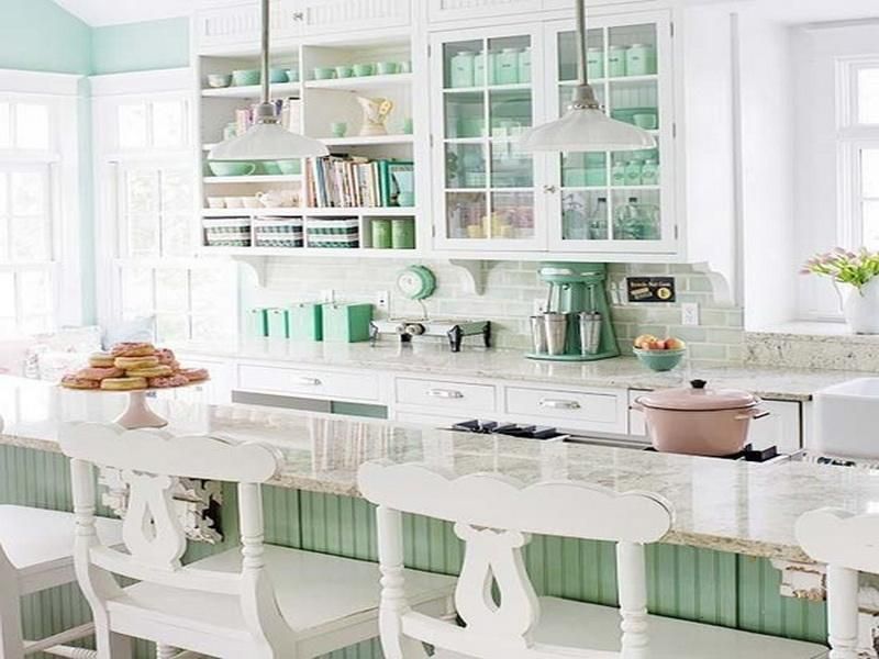
I love the cool sophisticated appeal of mint green. It gives a playful flare to any space. I’d paint the walls mint green with highlights of white through baseboards window frames, wainscoting and crown molding.
God has definitely been blessing us and it has only been recently that we have splurged a bit on ourselves since we’ve been together :O. I know I know. It’s amazing how if you trust in Jesus, He begins renewing you from the inside out. Thankful ♥
Here are my pics for Mint Green inspired spaces and accents:
What brings this look home for me is the use of the mint green as an accent color instead of the main color. The granite and cool greys, such as the black splash plays off well with the coolness of the mint. While the blue (in the corner by the window) is actually balanced well because it’s shade matches a dreamy sky blue, reminds you of a perfect day, ahhh. I also love how you can see a piece of the Farm house sink in the corner. I love those sinks for a kitchen! I also thought it was a great choice to use no drapes for the photo because of the flood of natural light you get. The chairs are truly the reason that confirmed this pick worthy.
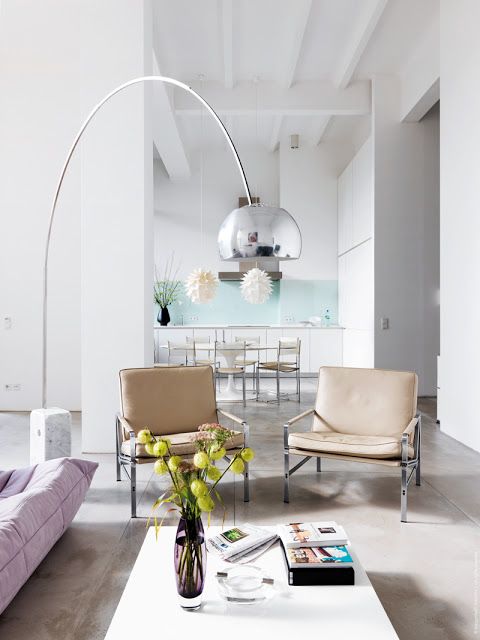
That lamp…that is all…
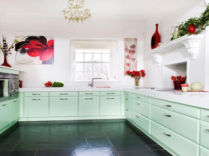
Not exactly what I usually go for but it’s a great mix of styles, the chandelier is really glam while the cabinets look really retro to me. The all white quartz counter top (or so I’m guessing because it’s too white to be natural stone, looks more like a man made product) really marries the two with a modern twist. The pops of red is really why I chose this look. It’s also visually interesting with the fireplace looking vent over the stove, creative. The floor tile also looks like soap stone to me, I could be wrong. Great pics for a retro chic modern kitchen.
These two! I had to, yes they are wedding cake toppers but def a keepsake or even a cute decoration to put a color story together.
Beloved, I’m just enthralled with this new direction that I’m heading and I’m having so much fun!! Let me know what you all think of the pics! I’d love to know! Do I have an eye for design or do you think ‘don’t quit your day job/hold your breath’ ♥
Ciao!
Join the blog cure and not only have a stunning website you can't break but know exactly what to write that people will actually read.
If you’re ready to step into visibility with clarity, strategy & confidence… you’re in the right place.
Get Access
This is my tried and true method, systems and all the Goods to get your podcast up and running all in one Trello Board!
Get Access
Only available inside the Society. Learn how to grow your email list and business with a Bundle. Plan and Launch your bundle in 90 Days!
Get Access
self paced
Courses
Available
Browse courses
THE STEPHANIE
BLACK FRIDAY
$197
$350
buy now
more info
view demo
view demo
THE CAMILLE
THE COURTNEY
$97
$97
more info
buy now
view demo
view demo
If you’ve been craving consistency, confidence, and a deeper connection with God as you grow your business, this challenge is your doorway into a fresh start. For 30 days, you’ll receive gentle guidance, daily encouragement, and Christ-centered prompts that help you show up with purpose—without pressure or overwhelm.
30-Day Visibility & Grace Challenge
30 days of Grace
join the challenge

